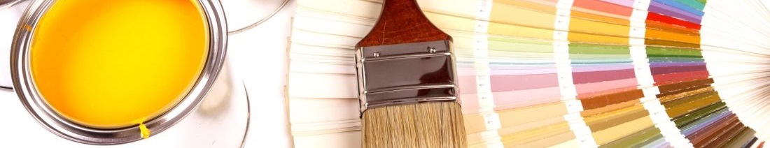
Color Charts
These are some paint companies that we recommend and utilize on a regular basis.
- Sherwin Williams Company
- Benjamin Moore Paints
- Kelly Moore Paints
- PPG Pittsburgh Paints
- Home Depot
- Lowe's
- Behr Color Smart Program
It's one thing to understand the makeup of individual colors, but quite another to appreciate how (and why) different colors work together in an aesthetically pleasing fashion. For that, it helps to be familiar with four basic types of color schemes: These color schemes are combinations of colors based on certain relative positions on the color wheel that have proven to work well for many people.
Monochromatic Color Schemes
Monochromatic color schemes consist of only one color. They can and often contain two or more hues of one color - light, medium and dark green, for example. This type of color scheme is usually (but not always) subtle and conservative; it can also be very sophisticated. A monochromatic approach is often a safe place to start for people who are just beginning to experiment with color, or for those who live in conservative neighborhoods where bold paint colors or color combinations are not very popular.
Complimentary Color Schemes
 Complementary schemes employ colors that are opposite each other on the color wheel. One example would be red and green. See the our picture of our color wheel. As you might expect, complementary schemes tend to have a great deal of contrast. Consequently, these treatments can be very lively. To keep them from being too lively, it is best if one color is dominant, with the other serving as an accent.
Triadic color schemes
 Triadic color schemes involve three colors that are equidistant on the color wheel - red-violet, yellow-orange and blue-green, for example. The simplified color wheel at right offers examples. These are typically highly complex color treatments that take an experienced eye to compose in an aesthetically pleasing palette.
Adjacent color schemes
 Adjacent color schemes (also known as analogous or related schemes) employ colors that are next to, or near, each other on the color wheel. An example from the color wheel at the right would be green, blue-green and blue. Typically, one of the three colors would be dominant, probably on the siding, while the other two would be accent colors. Although visually complex, adjacent color schemes are typically not as difficult to create as triadic treatments, since there is inherent harmony in colors that are adjacent on the color wheel.
Painting 'Fun Facts'
Choosing a Paint Color
- Start by studying the darkest colors or shades on any paint strip to match your furnishings. Once you have a winner, choose a tint toward the middle to top (lighter) of the strip for the wall color.
- Light colors (airy) and cold colors (which seem 'distant') tend to expand spaces.
- The more color contrast you use in a room, the smaller it will look.
- Consider painting the woodwork (base, trim, etc.) the same color as the walls.
- Darker walls make the room appear smaller as these warm colors seem to advance or 'move in toward' you.
- Darker colors; however, do make a room seem more intimate.
- To make a square room seem less 'boxlike', paint one wall in a deeper tone that the other three walls.
- To lengthen a hallway, paint walls a deep tone and paint the ceiling a lighter tone.
- Painting ceilings will actually make the room look larger by pushing the walls out. Consider painting a ceiling the same color as the walls (if a light color) to negate their boundaries.
- Low ceilings painted in pale shades seem higher.
- High ceilings painted two or three shades darker than the walls will seem lower and thus will effectively warm the room.
- Warm colors will cheer up rooms with northern light.
- Cool colors mellow out rooms with strong southern light.
- Bright colors appear more vivid in strong light.
- Neutral colors work well in rooms with east and west light.
- Consider using bright, uplifting colors for halls, stairs, and connecting areas that people simply pass through.
- Consider using deep colors in dim rooms. People often use white paint, but deep colors can turn a lack of light into a color asset.
- Paint color appears deeper in glossy or shiny paint sheens.
- Colors appear brighter on the wall than they do in the can.
- Colors look cooler when dry.